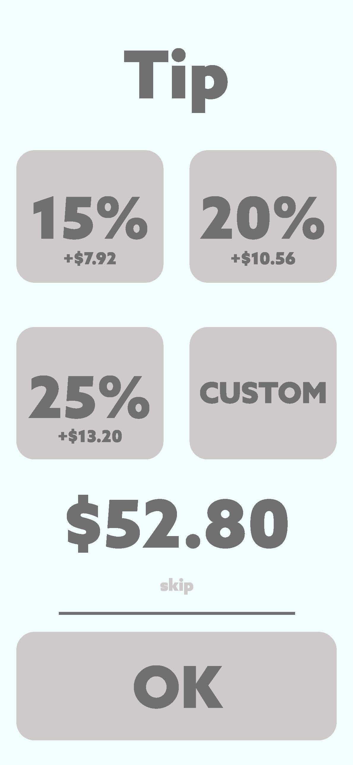
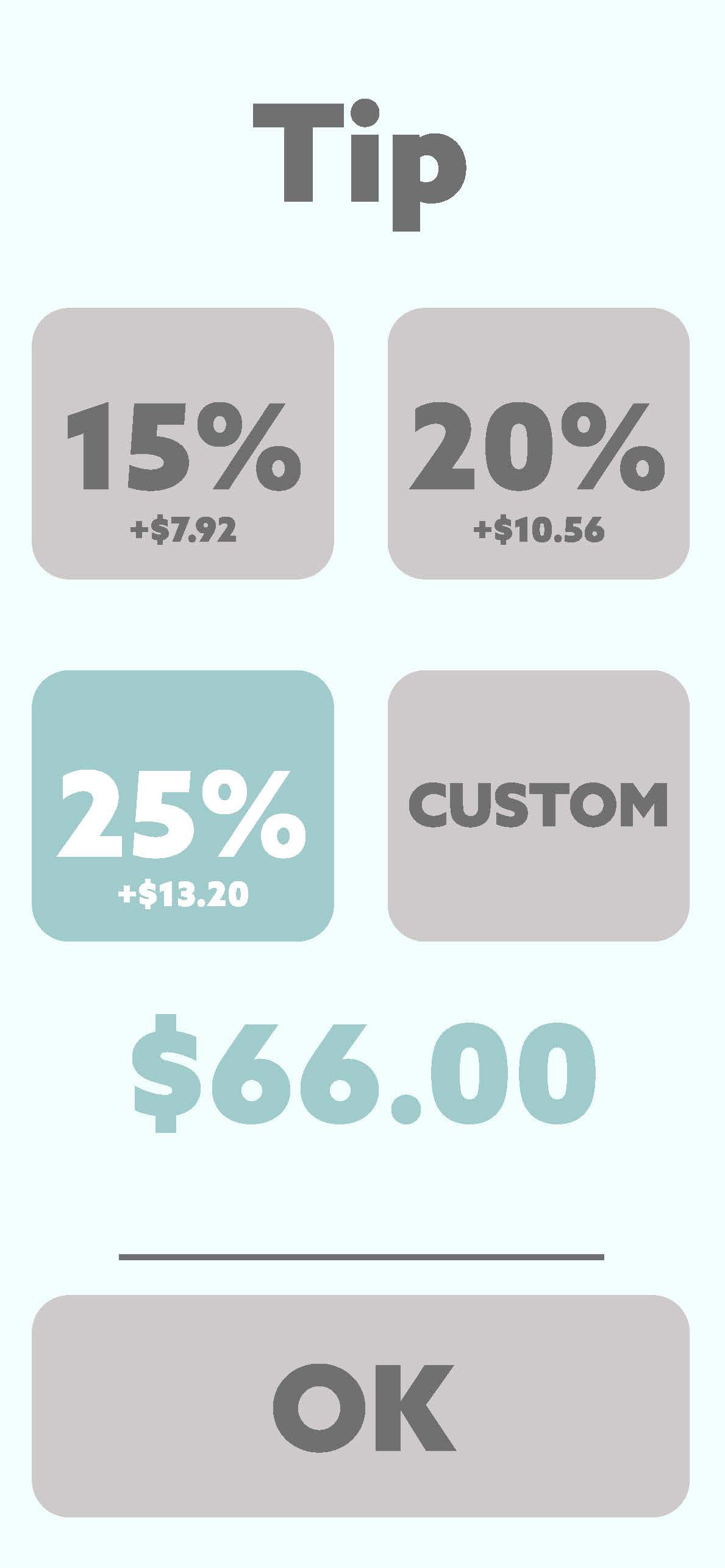
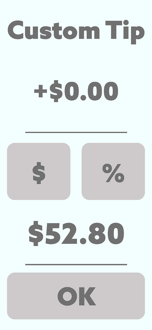
This UX tip screen project was developed to enhance accessibility in retail applications. Small businesses, from local pho restaurants to curated thrift boutiques, often rely on tablets and smartphones for payment processing. Yet, many retail apps fail to accommodate the diverse needs of these businesses' audiences.


Drawing from my firsthand experiences in food service and retail during college, I noticed common issues: patrons struggling to read screen text, confusion over payment options, and difficulty applying tips. These challenges highlighted the need for more accessible design solutions.
To address these pain points, I crafted user-friendly interfaces with bold text and high-contrast colors. The use of large, thick characters improves visibility for customers with visual impairments. I also implemented a clear grid layout to prioritize transaction details, ensuring that crucial information—like pricing—is easily distinguishable. Additional details, such as order descriptions, are presented in bounded sections for a more intuitive user experience.
